Hiya, still on day 6 of Stretch Your Stamps 2 at Online Card Classes and I again chose this lovely Mpress stamp set. I used Hero Arts white embossing powder, Distress Inks in Seedles Preserves, Mustard Seed, Festive Berries and Ripe Persimmon, a waterbrush, sentiment from TPC Studio and a corner rounder to add some interest.
Happy Scrappin'
Purple
Showing posts with label waterbrush. Show all posts
Wednesday, 20 August 2014
Tuesday, 19 August 2014
Stretch Your Stamps 2 Easy Watercolour Outline and Debossing
So we are at my second card from day 5 of Stretch Your Stamps 2 at Online Card Classes and I have chosen to use an Mpress stamp set, same flower again I know lol. It looks good what can I say? I used Distress inks in Pine Needles and Aged Mahogany for the flower and Tumbled Glass for the border. I have used some Hemtique Twine and a Buttuerfly border punch I have for the itty butterflys. Really need to start writing on my dies what brand they are . . . I coloured the butterflys with Aged Mahogany so they tied in with the flower and sentiment from Whimsy Stamps.
Happy Scrappin'
Purple
Tuesday, 12 August 2014
Stretch Your Stamps 2 Ombre Effects
Onto day 2 of Stretch Your Stamps 2 at Online Card Classes and today we are doing a little ombre. I used watercolour for this but you can use any colour medium. I used Windsor & Newton Cotman watercolours in turquoise. The background stamp is from Fiskars, white embossing powder from Hero Arts, a Spellbinders die cut in my Ebosser and the sentiment is from Kaisercraft.
Happy Scrappin'
Purple
Monday, 11 August 2014
Stretch Your Stamps 2 Multi Layer Emboss Resist Part 3 Bonus
I couldn't waste this lovely piece I had left over from Stretch You Stamps 2 over at Online Card Classes so I decided to turn it into a card too. I added some Prima flowers and a bling brad to give the card a lift. The cardstock I chose for the card base fits right in between the orange and yellow mixing :)
Happy Scrappin'
Purple
Happy Scrappin'
Purple
Stretch Your Stamps 2 Multi Layer Emboss Resist Part 2
Hiya, I am doing Stretch Your Stamps 2 over at Online Card Classes, it's running right now if you want to join in. The beauty of these clsses though is that you can do them whenever you want :) This card uses all the same products as the last one so I won't repost them here. The only difference is the die is from mpress and I've added glossy accents over the top and scattered some sequins about the place lol
Happy Scrappin'
Purple
Happy Scrappin'
Purple
Sunday, 10 August 2014
Stretch Your Stamps 2 Multi Layer Emboss Resist Part 1
I used Hero Arts Seafoam embossing powder, Windsor & Newton Cotman watercolours, watercolour paper, the background stamp and the letters for "to you" are from Fiskars stamp sets and the die was a freebie from a magazine :) Free stuff is good!
Happy Scrappin'
Purple
Saturday, 19 July 2014
A Very CAS Birthday With Gelatos
Hi everyone :) Still having computer issues and well to be honest issues with the freezing winter we are having in Aus this year. It's that time again though and this time for the Purples it's ANYTHING GOES at Eclectic Ellapu. Sorry for the glare on my card but I forgot to take a pic before I packaged it up to sell lol.
This was a very easy card to make. Basically I stamped my image straight on to 300gsm white cs that is made so you can work right on it. I got it from a craft show I went to last year and I'm hoping when I go back in November that they have more. I coloured using Faber-Castell Gelatos I used with a waterbrush straight from the tubes so I could get the intense colour. I made sure not to use too much water so the cs wouldn't warp and the colour wouldn't bleed through.
I went around the edge of the card with blue and smudged it with my finger and then did the same with a Tim Holtz Movers and Shapers Label with a pink gelato. I used foam tape to raise the label for a little dimension. As you can see this was a nice quick card to make and I was trying out another CAS idea. I'm getting there I think lol.
Thanks for stopping by
Happy Scrappin'
Purple
This was a very easy card to make. Basically I stamped my image straight on to 300gsm white cs that is made so you can work right on it. I got it from a craft show I went to last year and I'm hoping when I go back in November that they have more. I coloured using Faber-Castell Gelatos I used with a waterbrush straight from the tubes so I could get the intense colour. I made sure not to use too much water so the cs wouldn't warp and the colour wouldn't bleed through.
I went around the edge of the card with blue and smudged it with my finger and then did the same with a Tim Holtz Movers and Shapers Label with a pink gelato. I used foam tape to raise the label for a little dimension. As you can see this was a nice quick card to make and I was trying out another CAS idea. I'm getting there I think lol.
Thanks for stopping by
Happy Scrappin'
Purple
Sunday, 6 July 2014
Large Flower Background And Flutter Trees
Hiya, long time no talk . . . My cat really did it this time :( She knocked a pretty big cup full of water all over my laptop and while it still works not all the keys work properly lol. So I have to use a combination of laptop and tablet to do a post and well most days it's just too much work lol. Anyways the challenge at Eclectic Ellapu for the Purples this time is Birthdays with Butterflies. If You didn't guess I picked that one ;) Not many pics this week as that's just too much work switching constantly between pad n lappy lol.
So because I just got my Inktense pencils and some new spellbinders dies I thought I would combine the two. The dies I used are In'spire Celebration and Flutter Tree D'lites. For a full list of suplies look in the labels. The copious amounts of cutting were done in my Ebosser.
1. Cut 6 sets of trees, butterflies and sentiments from plain cs
2. Stamp background and then position tree and sentiment, die cut
3. Colour the background with a watercolour medium ( I used my new inktense set squeal), I hadnt kept my middle tree pieces but I decided the finished card needed them and went a hunting lol. Next time I will make sure to colour these at the same time too.
4. Glue the 6 trees together plus the stamped tree, glue 3 sentiments plus the stamped one together.
5. Once you have trimmed your background cut a card base to measure and then go over the edges of the base and background with white Adirondack Paint Dabber
6. Adhere background to base and then add the tree and sentiment.
7. The butterfly dies join two together at a time so what I did for these was turn my stamp stamp side up and work out roughly where I wanted the butterflies and pressed them onto the stamp then matched up the lines on the background.
The inspiration for this card came from one Jennifer McGuire posted on her blog a few months ago. She only used a sentiment but I thought this is so cool it could work with anything :)
Happy Scrappin'
Purple
So because I just got my Inktense pencils and some new spellbinders dies I thought I would combine the two. The dies I used are In'spire Celebration and Flutter Tree D'lites. For a full list of suplies look in the labels. The copious amounts of cutting were done in my Ebosser.
1. Cut 6 sets of trees, butterflies and sentiments from plain cs
2. Stamp background and then position tree and sentiment, die cut
3. Colour the background with a watercolour medium ( I used my new inktense set squeal), I hadnt kept my middle tree pieces but I decided the finished card needed them and went a hunting lol. Next time I will make sure to colour these at the same time too.
4. Glue the 6 trees together plus the stamped tree, glue 3 sentiments plus the stamped one together.
5. Once you have trimmed your background cut a card base to measure and then go over the edges of the base and background with white Adirondack Paint Dabber
6. Adhere background to base and then add the tree and sentiment.
7. The butterfly dies join two together at a time so what I did for these was turn my stamp stamp side up and work out roughly where I wanted the butterflies and pressed them onto the stamp then matched up the lines on the background.
The inspiration for this card came from one Jennifer McGuire posted on her blog a few months ago. She only used a sentiment but I thought this is so cool it could work with anything :)
Happy Scrappin'
Purple
Sunday, 1 September 2013
Journal Page with Gelato's, Quickutz and Copics
So I finalllly did another page in my Journal lol. Our Dt Challenge for the Purple team this fortnight is make the sentiment/saying the main focus of your project. Being an Aussie (pronounced like Ozzie), I have always adored Dorothea McKellar's My Country (click the link to read full poem). So that is what inspired this page :)
After cutting the images I gave them a little sand and added some distress inks. Rusty Hinge for Uluru and Crushed Olive for the greenery.
I then decided I wanted to add some gradiated colour to the word strips with blue and green copics. I started with the darkest blue I wanted to use and worked to the lightest, then from he lightest green to the darkest. I am hoping the greens look a little better when they finish drying lol.
After adhering them to the page with tape ( I used a snail type and it wanted to rip the backs off the cs... That was fun lol ) I took a Distress Marker and added dashes around the word strips. I am thinking of adding some of those lil m shaped birds but am scared I will wreck it hehe. My handwriting and drawing is very bad lol.
Not only is my printer broken but so is my camera. At first the whole thing was wiggy but I reset it to factory defaults and most of it seems OK now except my HD video. It will take standard video but it's poor quality lol. Oh and I keep losing things. I have three rolls of tape on the go. . . Think I can find any?
Anyways Happy Scrappin'
Purple
First up I took brown and green Faber-Castell Gelatos and scribbled them randomly on the bottom half of my Journal page. As you can see I only used a hint of Green. The area I am depicting is a very dry and harsh part of central Australia. I then used blues and whites to do the sky. I used a waterbrush to soften and bled the colours together. Adding more colour as needed and blending that in.
Unfortunately my printer has decided to give up the ghost so I had to ask my friend to print this, my favourite verse out for me. I then cut each line into its own section with my KaiserCraft Cutter.
"I love a sunburnt country,
A land of sweeping plains,
Of rugged mountain ranges,
Of droughts and flooding rains,
I love her far horizons,
I love her jewel-sea,
Her beauty and her terror--
The wide brown land for me!"
I used the Tim Holtz Core'dinations Distress CS pad to cut Uluru and some greenery using a Quickutz die from the Australia set. Love this set it also has Sydney Tower (I still call it Centrepoint in my head lol), a Koala and Kangaro, a slouch hat, a boomerang and the Aussie flag :) I love cutting with my ebosser :)After cutting the images I gave them a little sand and added some distress inks. Rusty Hinge for Uluru and Crushed Olive for the greenery.
I then decided I wanted to add some gradiated colour to the word strips with blue and green copics. I started with the darkest blue I wanted to use and worked to the lightest, then from he lightest green to the darkest. I am hoping the greens look a little better when they finish drying lol.
After adhering them to the page with tape ( I used a snail type and it wanted to rip the backs off the cs... That was fun lol ) I took a Distress Marker and added dashes around the word strips. I am thinking of adding some of those lil m shaped birds but am scared I will wreck it hehe. My handwriting and drawing is very bad lol.
Not only is my printer broken but so is my camera. At first the whole thing was wiggy but I reset it to factory defaults and most of it seems OK now except my HD video. It will take standard video but it's poor quality lol. Oh and I keep losing things. I have three rolls of tape on the go. . . Think I can find any?
Anyways Happy Scrappin'
Purple
Labels:
copic,
core'dinations,
distress ink,
distress marker,
distress pad,
dorothea mckellar,
ebosser,
faber castell,
gelato,
i love a sunburnt country,
kaisercraft,
my country,
quickutz,
tim holtz,
uluru,
waterbrush
Thursday, 14 February 2013
Willow Holding Baby Card
I was given a paper stack for christmas with quite a few papers I am going to find challenging to use. Some are quite bright lol. It's by Kaisercraft and is called Antique Rose. I had taken a particularly bright orange piece and attacked it with some Picket Fence Distress Stain and quite liked the results so decided to use it to make a card.
I was looking around for some ideas and my eyes set upon a stamp I got when I was at a craft show in 2012. The stamp is from Whiff of Joy called Willow Holding Baby. I had never heard of the stamp company before but I fell in love with the stamp :). Good thing it was 50% off haha.
I stamped her onto watercolour paper and outlined her with distress markers, main colours used are Dried Marigold and Spiced Marmalade for her dress, Broken China for the baby blanket and a mix of Frayed Burlap and Tattered Rose for the skin with a hint of watered down Barn Door for the cheeks. Using my Tim Holtz waterbrush I wet the outlines and moved the colours about. I dried the image and reapplied colours as needed. I scribbled a random mix of greens around her feet and mixed them with the waterbrush for grass. I then outlined around the rest of the image with tumbled glass and pulled the colour outwards. I cut the image with a Lifestyle Crafts Nesting Oval and then used my ink blending tool with Bundled Sage and Tumbled Glass around the edges.
To mount this on I cut the largest Nesting Oval Doily from Lifestyle Crafts out of the paper I had previously used Picket Fence Distress Stain on. I then used a Franchville Glue Pen around the holes of the oval doily and sprinkled Rock Candy Distress Stickles Dry Glitter over this.
I adhered the coloured image to this and then selected another sheet of paper from the Antique Rose stack to mount this on. I cut the sheet the same side as my card and then used the Tonic edge distresser to distress the edges. I found some matching ribbon for one side of the card and used double sided tape to adhere it. Then the fun began haha.
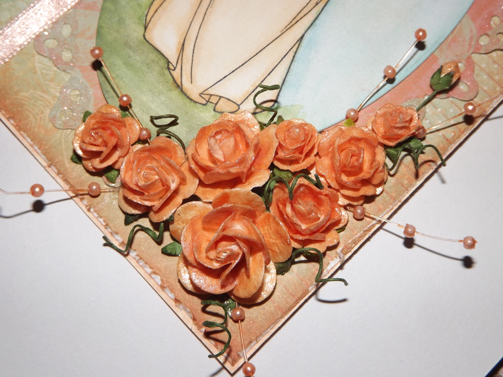
I got a bunch of I am Roses from my stash and coloured them with some home made glimmer glaze (recipe for this one was Reeves Iridescent Medium, Multi Medium Glossy, a spritz of water and Dried Marigold Reinker til desired colour is reached). I had fun working out how to do this cluster as I haven't had much practice so whenever I try it it takes me hours or in this case days lol. I coloured some pearl spray with an equal mix of Salmon and Peach Bellini in a snap lock bag and made some twizzles with the stems of the flowers. I glued them all on with Glossy Accents.
And there you have it. I had most of it done quick and easy. It was just the flowers that almost beat me but I won in the end lol. One thing I did learn was to colour a small section at a time to add water too as it's harder to blend once it dries. So in love with this stamp. I could colour her over and over! lol
Happy Scrappin'
Purple
Moving Along With The Times - Only Girls Aloud
Make It Monday - Anything Goes
Eclectic Ellapu - Girly
The Joyful Stamper - Inspire Me Fridays
Labels:
alcohol ink,
antique rose,
distress markers,
distress stain,
doily,
franchville,
glossy accents,
kaisercraft,
lifestyle crafts,
oval,
ranger,
rock candy,
tim holtz,
tonic,
waterbrush,
whiff of joy
Sunday, 10 February 2013
A Little Experimentation Goes a Long Way
As I said in my previous post I was going to play some more and share the results. I have used stains, watercolour pencils and gelatos and I have a fair few things to share. I am sharing them before I turn them into cards. I think I am getting the hang of the gelatos too :) I have made some very light samples but I can always add more colour if I wish (good thing I have been taking notes on the back of the samples lol).
Let's start with gelatos. My first attempt was to wet the watercolour paper first, then lay down the colour spritz again and blend with my finger . . . it didn't work very well (might be more to do with the colours I used lol) so I tried again with a brush. That's the sample on the bottom left. Colours used for these samples are Black Licorice, Chocolate and Butterscotch.
For the top sample I applied dry and spritzed three puddles of water on my mat. I started at black and worked to lightest blending with a paintbrush. I added a little too much water in some places so I used a wet brush directly to the gelato I needed to fix the problem . I had so much colour left on my mat that I got sick of wasting it and started using the lefovers on leftover scraps of watercolour paper. That's the image on the bottom right.
The next set were all made when I applied gelatos to a wet surface and blended with a paintbrush for the first gen (top pic). These colours seemed to go on very thick and allowed me to make the original plus two more samples. Colours are Blueberry, Boysenberry and Grape. The second gen, to the right, was made swiping the colours straight off the craft mat and third gen I sprizted the leftovers then applied them to the cs for the third gen pale look on the bottom.
The following two were made at the same time. I applied gelato to my ranger craft mat and spritzed with water to make a light wash. These have only one coat but If I had wanted darker colours I could have just made one and dried in between layers to darken the colours. I used the metallics in Melon, Grape and Mint.
Next up we have a couple done with distress stains. I used three colours for each, spritzed with water and blended them with my finger. When I blend using my finger I tend to work from lightest to darkest then flip and work from lightest to darkest to work the colours into each other and smooth them out. The top one uses Peacock Feathers, Evergreen Bough and Bundled Sage and has been flicked with water to get the cool droplet effect. The bottom one uses Aged Mahogany, Fired Brick and Worn Lipstick.
I only have two Tattered Angels Glimmer Mists and for ome reason one of mine looked nowhere near the colour on the back :( It was supposed to be a really pretty pink but instead there was barely any colour there at all lol. The colour was supposed to be pink bubblegum. I added 20 drops of picked raspberry reinker and a spritz of Dylusions in Postbox Red. I ended up with a colour a bit darker than the colour I was supposed to have but very pretty none the less :)
I used a paintbrush dipped in the bottle and started painting each colour on from their respective ends and blended with my finger in the middle. The yellow is Lemon Zest.
Onto Derwent Watercolour pencils. Each sample uses the same set of colours applied directly to dry paper. The colours are 2, 7, 8, 10 and 12. I spritzed the top one with water then used my finger to blend the colours. I could have added more red but liked the washed out effect and decided to lave it as. The bottom one was blended with the Tim Holtz Waterbrush.
The top picture uses the colours 40, 43, 44, 45, 46 and 47. I used a waterbrush and pulled colour directly from the pencils. I really like this technique. The middle pic uses 18, 21, 22, 24 and 25. I coloured right on the paper for this one and blended with a waterbrush. I spilled a drop of the mist I mixed onto this one so I decided to make the best of it and used the spray tube from the bottle to add some drips and lines, sprized again and rand some paper towel over the top to get that faded look.
The bottom pic uses 37, 38, 39, 40 and 44 coloured directly yo the paper. Not sure why I added this pic in the bunch because I cannot remember how I did it lmao.
This next pic uses inktense pencils. I used 1200, 1300 and 1400 straight from the pencil with the waterbrush for the top image and for the bottom one I used the pencils coloured right onto a tag and blended with the waterbrush. As you can see it is very streaky compared o others so water colour paper is definitely best.
I realised as I was typing this that i forgot to do a sample using the waterbrush from the gelato then onto the paper but anyways I am sure you get the idea. Hope this helps you in some way.
Happy Scrappin'
Purple
Let's start with gelatos. My first attempt was to wet the watercolour paper first, then lay down the colour spritz again and blend with my finger . . . it didn't work very well (might be more to do with the colours I used lol) so I tried again with a brush. That's the sample on the bottom left. Colours used for these samples are Black Licorice, Chocolate and Butterscotch.
For the top sample I applied dry and spritzed three puddles of water on my mat. I started at black and worked to lightest blending with a paintbrush. I added a little too much water in some places so I used a wet brush directly to the gelato I needed to fix the problem . I had so much colour left on my mat that I got sick of wasting it and started using the lefovers on leftover scraps of watercolour paper. That's the image on the bottom right.
The next set were all made when I applied gelatos to a wet surface and blended with a paintbrush for the first gen (top pic). These colours seemed to go on very thick and allowed me to make the original plus two more samples. Colours are Blueberry, Boysenberry and Grape. The second gen, to the right, was made swiping the colours straight off the craft mat and third gen I sprizted the leftovers then applied them to the cs for the third gen pale look on the bottom.
The following two were made at the same time. I applied gelato to my ranger craft mat and spritzed with water to make a light wash. These have only one coat but If I had wanted darker colours I could have just made one and dried in between layers to darken the colours. I used the metallics in Melon, Grape and Mint.
Next up we have a couple done with distress stains. I used three colours for each, spritzed with water and blended them with my finger. When I blend using my finger I tend to work from lightest to darkest then flip and work from lightest to darkest to work the colours into each other and smooth them out. The top one uses Peacock Feathers, Evergreen Bough and Bundled Sage and has been flicked with water to get the cool droplet effect. The bottom one uses Aged Mahogany, Fired Brick and Worn Lipstick.
I only have two Tattered Angels Glimmer Mists and for ome reason one of mine looked nowhere near the colour on the back :( It was supposed to be a really pretty pink but instead there was barely any colour there at all lol. The colour was supposed to be pink bubblegum. I added 20 drops of picked raspberry reinker and a spritz of Dylusions in Postbox Red. I ended up with a colour a bit darker than the colour I was supposed to have but very pretty none the less :)
I used a paintbrush dipped in the bottle and started painting each colour on from their respective ends and blended with my finger in the middle. The yellow is Lemon Zest.
Onto Derwent Watercolour pencils. Each sample uses the same set of colours applied directly to dry paper. The colours are 2, 7, 8, 10 and 12. I spritzed the top one with water then used my finger to blend the colours. I could have added more red but liked the washed out effect and decided to lave it as. The bottom one was blended with the Tim Holtz Waterbrush.
The top picture uses the colours 40, 43, 44, 45, 46 and 47. I used a waterbrush and pulled colour directly from the pencils. I really like this technique. The middle pic uses 18, 21, 22, 24 and 25. I coloured right on the paper for this one and blended with a waterbrush. I spilled a drop of the mist I mixed onto this one so I decided to make the best of it and used the spray tube from the bottle to add some drips and lines, sprized again and rand some paper towel over the top to get that faded look.
The bottom pic uses 37, 38, 39, 40 and 44 coloured directly yo the paper. Not sure why I added this pic in the bunch because I cannot remember how I did it lmao.
This next pic uses inktense pencils. I used 1200, 1300 and 1400 straight from the pencil with the waterbrush for the top image and for the bottom one I used the pencils coloured right onto a tag and blended with the waterbrush. As you can see it is very streaky compared o others so water colour paper is definitely best.
I realised as I was typing this that i forgot to do a sample using the waterbrush from the gelato then onto the paper but anyways I am sure you get the idea. Hope this helps you in some way.
Happy Scrappin'
Purple
Sunday, 3 February 2013
A Little Inspiration and Some Experimentation
I was recently looking at a Simon Says Stamp Blog post featuring Jennifer Mcguire and decided to try my own version of what she did in the video. I also thought I would try different mediums as well :) I am not so good at leaving loads of "white space" so to speak though so mine in general are a little busier.
First up I thought I would share the ones I did with my 12 pencil set of Inktense. (The 72 set is winging it's way from England as we speak as they are much cheaper there lol:)). I have made 2 cards so far with the inktense though I have a couple of extra pieces to use up as well. I was seeing what combos I could make with the small set.
Using Bark 2000, Baked Earth 1800 and Tangerine 0300 I coloured on a strip of Crafters Choice watercolour paper making sure to over lap each colour. I worked from darkest to lightest. I then used my faber castell water brush starting at the dark end and working my way to the tangerine. As I had laid down plenty of colour they blended nicely and my orange started to take on a brownish hue. It wasn't as dark as I wanted so I dried the strip then added more colour using my waterbrush directly onto the pencils then the paper. These colours made for a very autumnal looking strip of paper.
I cut a wide V shape from one end of the strip to make a banner and then stamped with perfect medium and embossed with a bronze embossing powder. I used a Carl punch to punch some maple leaves from around the banner. I also cut a couple from the leftover banner bits. I used these to create a falling leaf effect down the card. I used foam squares behind the banner to raise it off the card. I decorated using some Viva Decor Pearl Pen in dark brown.
The next card I made a nice rainbow effect by using three totally different colours, Sun Yellow 0200, Fucshia 0700 and My fave from this set of 12, Teal Green 1300. Again I started by by laying down my colours on the strip of paper and overlapping slightly. Pink then yellow followed by the teal. I found my Tim Holtz water brush finally... Yay! So used that to start blending from pink to yellow. Got a nice orange in the middle by overlapping the colours and a nice light green when blending the yellow n teal.
I stamped using Perfect Medium for the sentiment and switched to Versamark for the presents. I learnt the hard way with the presents to colour first and then stamp over the top otherwise the inktense stays on the Hero Arts White embossing powder lol. The Happy Birthday stamps from both cards are from Hero Arts Birthday Sayings.
For the card base I used a Tim Holtz Swirl embossing folder on the front and then spritzed with Tattered Angels Glimmer Mist in Pink Bubblegum (mine looks nothing like the back of the bottle : (. . .) and Lemon Zest as well as took the sprayer out of the bottle to drop a few small droplets down.
I then took my inktense pencils and used the Tim Holtz waterbrush on them one colour a time (works great for this technique) and flicked them over the front of the card ( I did a little flicking inside but forgot to take a pic of that lol). I also spritzed the banner with the Lemon Zest.
Sorry about some of the pics. I took some with my phone and they are shocking! Ended up grabbing my proper cam out so I could show decent pics of the finished product. Next up I again adhered the banner with foam squares as well as the presents on the banner. For the sentiment inside that I forgot to snap (cards already been given to a young lass celebrating her 13th birthday) I used Mustard Seed Distress Marker in the middle, Peacock Feathers distress pad on one side and Picked Raspberries on the other. Hope they release the 12 new colours in markers soon!
I have also tried this with distress stains and love the effect that gives and have a really pretty card to share in purples next. Also tried gelatos but was not so happy with how that turned out, need to play some more as I think I am using to much water. It's such a fun and easy technique I am going to try it with all the blendable media I can :). I also have the 72 set off the regular derwent watercolours so will use them as well for sure. Of course the colours will be more muted than the inktense but that can be pretty too!
Happy Scrappin'
Purple
I am submitting this at;
Simon Says Stamp - Anything Goes
Joyful Stamper - Anything Goes
Make It Monday - Anything Goes
Artistic Inspirations - Embossing/Anything Goes
Thursday, 31 May 2012
My New Penny Johnson Stamp
Last week I bought my first lil girls stamp. My first and only so far lol. I don't have any lil boy stamps yet either... But give me time :) Anyway I wanted to see how they would turn out coloured in different mediums. I used gelatos, big brush markers and artist markers as well as distress markers.
I am a relative newbie when it comes to colouring and shading but I am learning as I go. First up I am going to show a card I made using Gelatos, Prima Fairy Belle papers and hemptique cord. I used my new Tim Holtz waterbrushes to colour my Penny Johnson Happy Day stamp with the Gelatos.
I then layered two different fairy belle papers after using the gelatos on the edges and the tonic distressing tool. I added brads to the corners of my stamped image and ran the hemptique cord around the edges. I used a thin strip of the same paper I mounted the image on accross the top of my card and then made a tag using a sizzlit die to go on top. I took more hemptique cord and ran it from the tag and under the strip in a criss cross pattern.
Ok next up I just have the rest of the images I coloured. First up is the Faber-Castell markers. I used both the big brush and the artist markers to colour with. On the left is the image I coloured straight from the markers, on the right I coloured using the waterbrushes.
Next up are the ones I did with distress markers. Again on the left is the image coloured straight from the distress markers, on the right the watercoloured image.
As I said I am still learning, but I am pretty happy with how the card turned out and hopefully I can do something nice with the rest of my images :)
Thanks for stopping by.
Happy Scrappin'
Purple
I am entering this into the Simon Says Stamp - Anything Goes Challenge
Just Keep On Creating - Anything goes
also Joyful Stampers Inspire Me Fridays - Anything goes
and Make It Monday - Anything Goes
Subscribe to:
Posts (Atom)